Bell Helmets Ecommerce Redesign
Case study
Over nearly a decade with Bell Helmets, I led the redesign of the brand's ecommerce website and continued evolving it through ongoing improvements to navigation, product discovery, merchandising, responsive design, and product storytelling. Working alongside developers, marketers, and product managers, I helped shape a digital storefront that balanced brand expression with usability.
What began as a major redesign became an ongoing effort to refine and expand the digital storefront — helping riders discover products, explore new technology, and move confidently toward purchase.
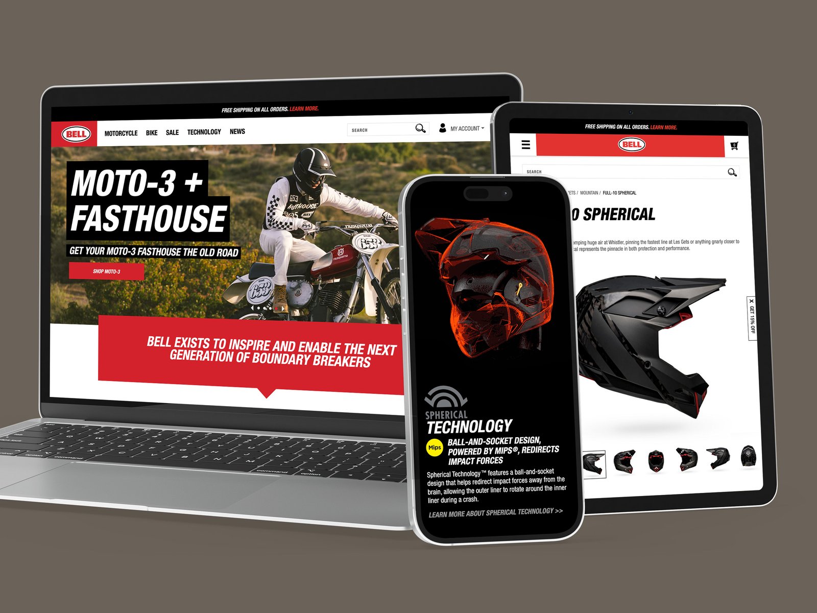
Interactive product storytelling
Showing technology — not just listing features.
Technical products deserve more than specification tables. Throughout the site I created interactive product storytelling using custom graphics, motion, and visual design to explain Bell’s innovations.
Whether introducing Spherical Technology or visualizing airflow systems, the goal was helping riders understand why the technology mattered.
Design system
Building consistency across the site.
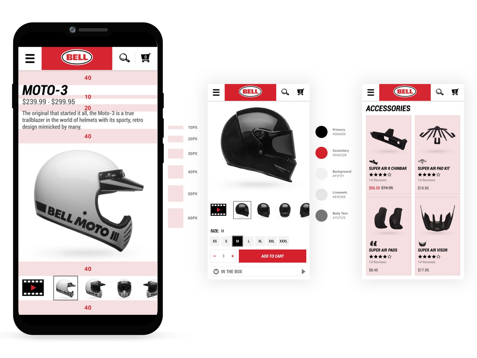
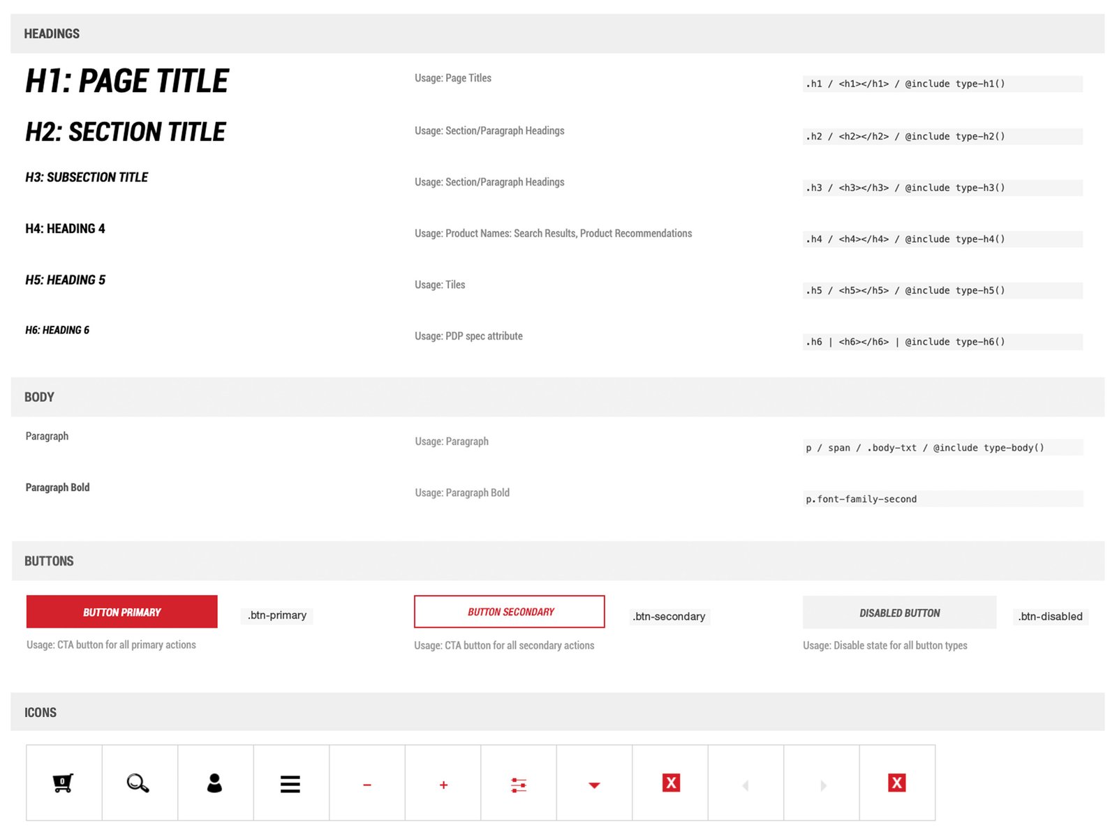
As the site grew, maintaining consistency became increasingly important. I created reusable interface standards covering typography, buttons, imagery, layout hierarchy, and responsive behaviors, helping keep new pages aligned while making design and development more efficient.
From product pages to accessories and checkout flows, every interface was designed to feel intuitive whether riders were browsing on desktop, tablet, or mobile.
Navigation & discovery
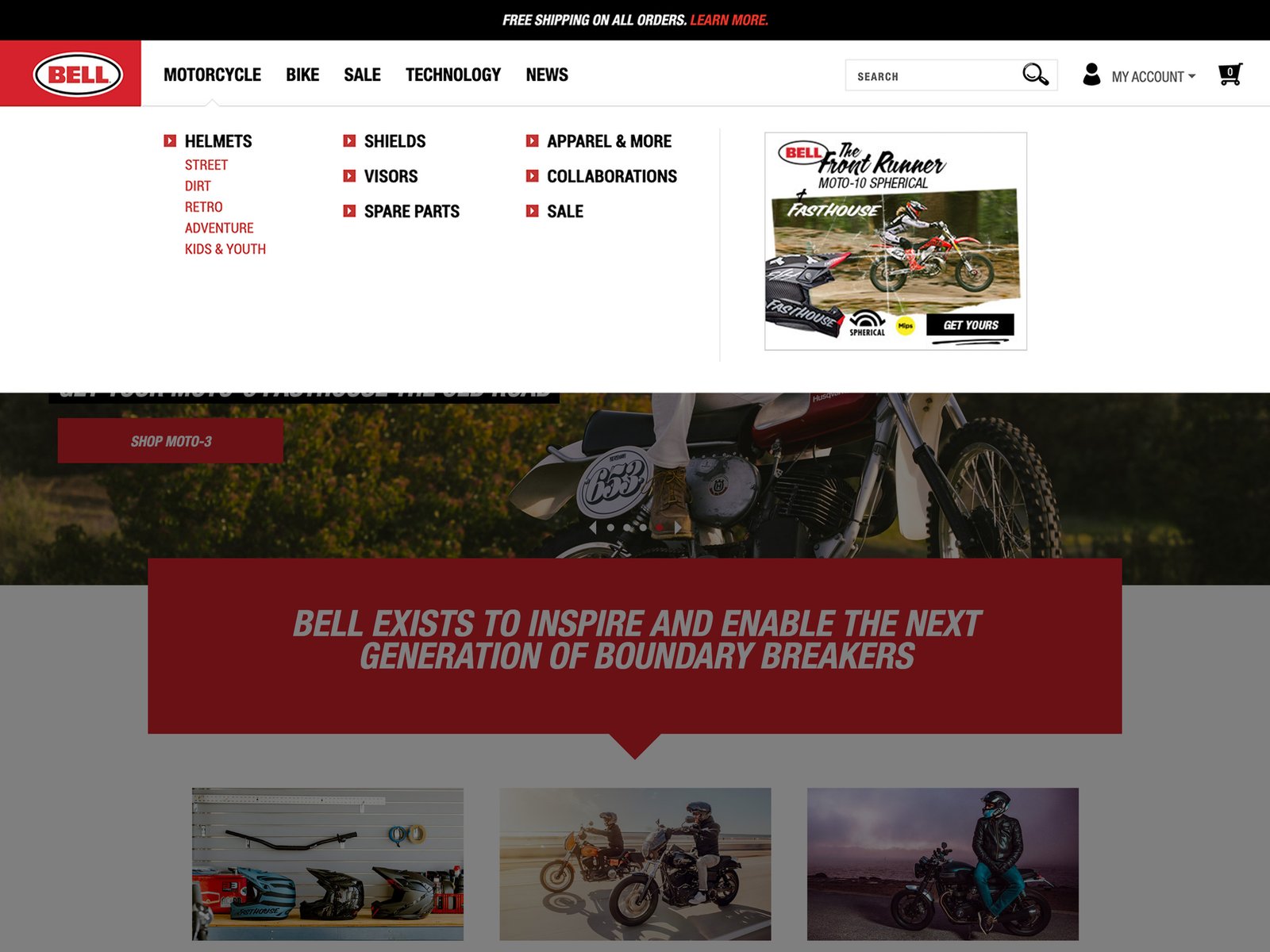
Making a large catalog easier to navigate.
As Bell’s product catalog expanded, navigation needed to scale without becoming overwhelming. I redesigned navigation patterns, category organization, and promotional modules to improve product discovery while giving campaigns and collaborations greater visibility.
Photography & art direction
Letting the photography tell the story.
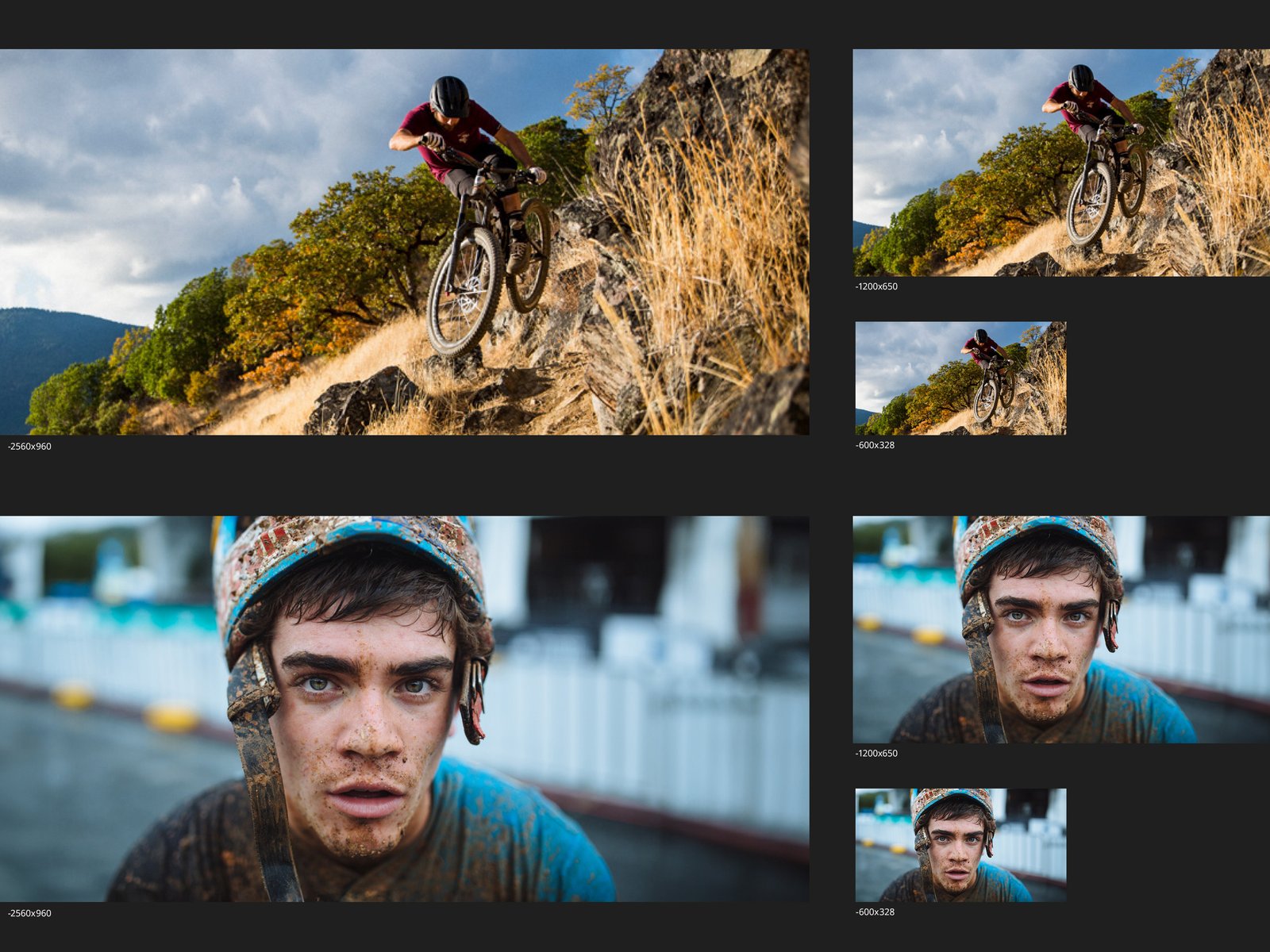
Bell’s photography was one of its greatest brand assets, so the interface was intentionally designed to let it take center stage. I carefully selected imagery that captured the energy, craftsmanship, and emotion of riding, using scale, composition, and restrained layouts to keep the focus on the product and the people behind it.
Beyond image selection, I established visual treatments and color palettes that complemented the photography rather than competing with it, helping create a digital experience that felt premium, immersive, and unmistakably Bell.
Across every update, the goal stayed the same: make Bell’s products easier to explore and the digital experience feel as considered as the helmets themselves.