CamelBak — Holiday Campaign
Case study
Every year, CamelBak’s holiday campaign had to do a lot — drive e-commerce sales across a broad product range, hold together visually across organic social, paid media, email, and the website, and feel seasonal without losing the brand’s outdoor identity. Working as part of CamelBak’s internal design team, I led the concepting, art direction, and production of assets for the annual holiday campaign, running October through January.
The creative challenge wasn’t just making things look festive. It was building a campaign system flexible enough to carry hundreds of individual assets across every touchpoint without losing coherence — and doing it at the pace an in-house team demands.
The concept
One idea that scaled everywhere.
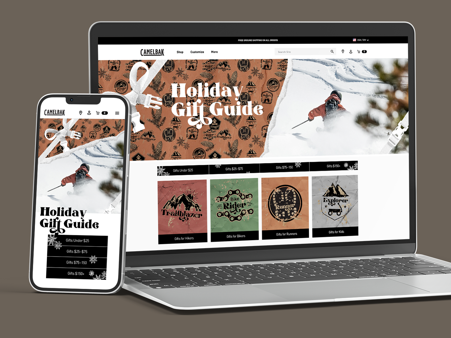
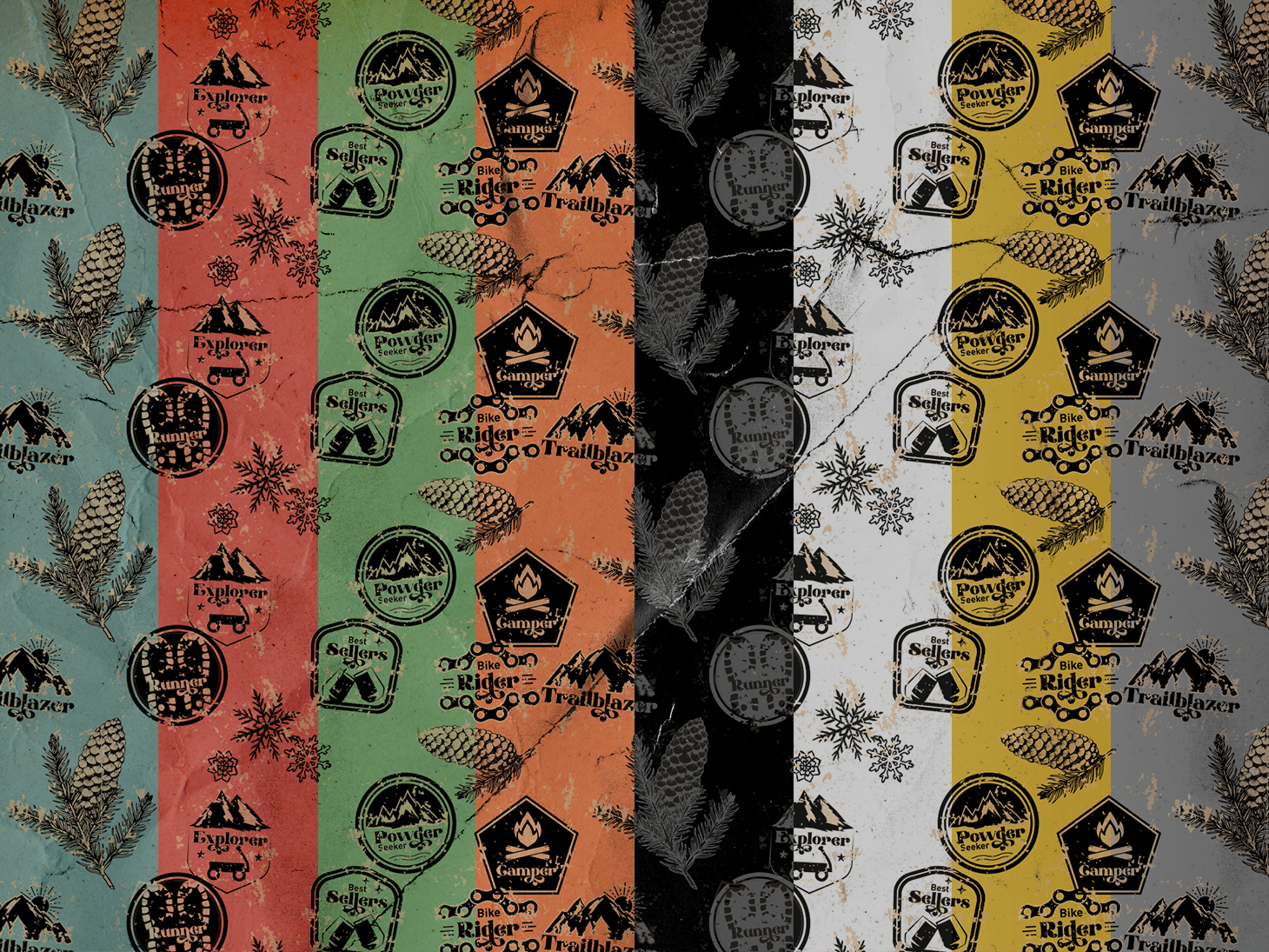
The creative direction centered on a nostalgic wrapping paper aesthetic — outdoor activity stamps and ribbon and bows rendered in a pattern that felt handcrafted and playful without being generic. It gave the campaign an identity that was distinctly CamelBak: rooted in outdoor culture, warm, and immediately recognizable across a cluttered holiday feed.
The pattern became the connective tissue. Once it existed, everything else — social assets, paid ads, email headers, website banners — had a shared visual language to pull from. The system scaled because the concept was strong enough to stretch.
Icons
Designed to work at any size.
A core part of the campaign was a set of custom icons representing CamelBak’s product categories — Runner, Rider, Hiker, Camper, Explorer, Trailblazer, and more. Each was designed to be visually bold and instantly legible at small sizes, where most of them would actually live.
The icons did two jobs: they helped customers navigate a wide product range without friction, and they gave the campaign an additional graphic element that reinforced the handcrafted, stamp-like aesthetic. Designed to work at any scale, across any surface, in any of the campaign’s colorways.
The style guide
A system built to stay useful.
To keep hundreds of assets consistent across a team and an extended timeline, the campaign needed a style guide that was actually useful — not a document that sat in a shared drive. The guide covered color, typography, pattern usage, icon application, photography direction, and layout principles, and served as the reference point for every asset produced across the full campaign.
Embedded in the team, I was able to build the guide and use it — which meant it stayed current and practical rather than aspirational.
Motion
Designed to work at any size.
Static assets alone weren’t enough to hold attention across paid and social placements. Both static and animated versions of key assets were produced to allow for A/B testing across placements — giving the media team the flexibility to test what drove engagement without needing a separate creative build each time.
The animated versions used the pattern and iconography as motion elements, adding energy without departing from the established visual system.
The result
One system. Every channel.
The campaign ran across organic social, paid media, email, and the CamelBak website — hundreds of assets, one coherent system. It produced a 21.5% increase in revenue, a 14.6% lift in traffic, and a 32.2% boost in orders, exceeding corporate benchmarks across the board.
Building the system from the inside meant the creative stayed consistent from concept through final delivery — no translation loss between brief and execution.
A campaign system built to scale — from a single icon to hundreds of assets across every channel.